



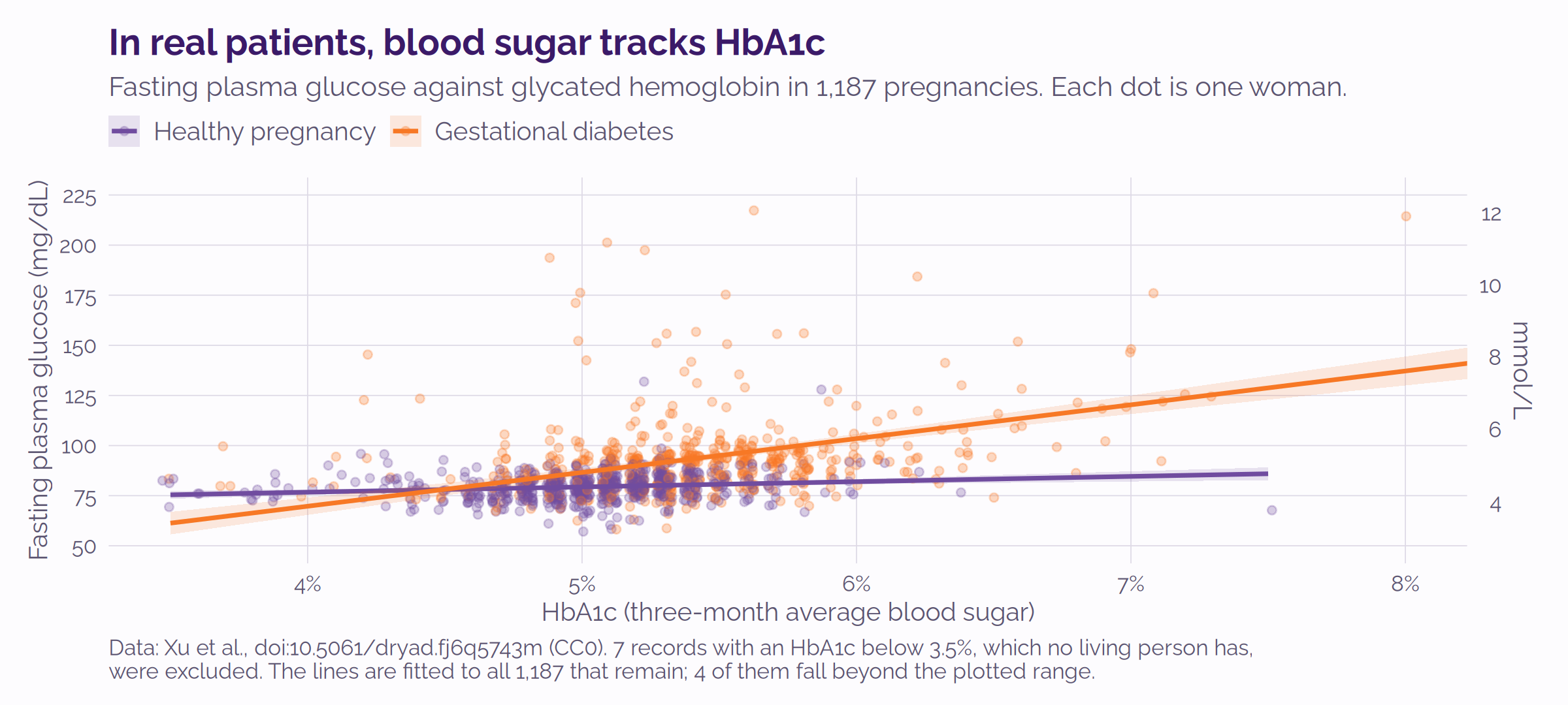
R Statistics on a Live VistA Instance
Sam Habiel
TL;DR
This is a post about connecting R to VistA via Octo and generating interesting statistical analysis and diagrams. At least look at the diagrams, which were all directly generated from R!
Introduction
I learned Statistics in college 20 years ago. I hoped to specialize in the area, but I eventually found that you must have a stomach for sitting for hours at a screen examining data and cleaning it up. No data ever comes clean.
Back then, the most popular software was SAS and SPSS. I learned SAS in school, but I barely remember any of its syntax. Fast-forward 15 years — my work with OSEHRA, WorldVistA, and the National Library of Medicine (NLM) got me in contact with a remarkable Open Source community called OHDSI. I first met them at an RxNorm conference at NLM. OHDSI was most remarkable because it was a functional open-source community. I had conversations with great people on how the community worked, but that’s a discussion for another time.
This community used a software package for statistics called “R”. I learned more about R over the years — it’s extremely capable (as you will see later in this blog post) — but it famously has very obscure syntax: assignment is <-, piping %>%
Today, R is (depending on the industry) the first/second most commonly used statistics package in the world. A thriving ecosystem of academics who use it to conduct studies but whose pay is not tied to the software itself means that maintainers can be easily found, sidestepping a common problem in open-source where people who maintain software are often never paid for it.
The object of the post is connecting R to VistA. Before we jump in, a brief introduction to VistA is in order: VistA is an Electronic Medical Record (EMR) originally developed by the Veterans Administration of the US Government, and was a leader for a long time in usability and innovation. It found some commercial success in the private sector in the US between 2005 to 2020, but has found its usage wane recently in favor of Epic and Cerner in line with the rest of the EMR industry. In Jordan, it is successfully used to run the health care system of the entire country. VistA code is public domain.
Statistics using R from VistA
I created 1,160 patients using Synthea, and loaded them into a VEHU image. Then, I used R with the PostgreSQL connector to connect to a Rocto listener. Rocto is part of Octo, YottaDB’s SQL-to-globals mapping software. VistA globals are “projected” to SQL tables using the scripts in YDBOctoVistA, including the new lab_chem_result.sql which makes lab data in VistA accessible from SQL.
I came in with specific ideas on which statistics to run. I used Claude Code to connect to the VistA database and run various ad hoc analyses on the data. I will refer to Claude directly when the work done is its own rather than mine.
I broke down this long post into the following sections:
- Connecting to the data
- Getting select vitals for analysis
- Analyzing the growth of children (chart, t-test)
- Analyzing hypertension diagnoses vs BMI (chart, chi-square)
- Analyzing blood pressure measurements vs BMI (chart, Pearson’s coefficient)
- Distribution of HbA1c (chart)
- Correlation of glucose and HbA1c (chart, Pearson’s coefficient)
- Trying all the analyses for yourself
- Software used
These are synthetic patients. The cohort was generated by Synthea and loaded into a full VistA instance. Except for the blogroll image and featured image (above), which were generated from a public domain dataset, no real patient data appears anywhere in this post.
Connecting to the data
R connects to a PostgreSQL database — the Octo protocol emulates PostgreSQL; the Octo documentation covers this under Connecting from R:
library(DBI)

con <- dbConnect(RPostgres::Postgres(),
                 dbname = "octo", host = "localhost", port = 1338,
                 user = "admin", password = "admin")
Getting select vitals for analysis
After connection, this query gets vitals from VistA and joins it to the patient file, restricted to Synthea patients. It returns 48,493 rows of blood pressures, heights and weights.
# One row per measurement, read straight from VistA's vitals global.
vitals <- dbGetQuery(con, "
  SELECT v.patient, v.vital_type, v.rate, v.date_time_vitals_taken,
         p.sex, p.date_of_birth
  FROM   gmrv_vital_measurement v, patient p
  WHERE  v.patient = p.patient_id                      -- vitals to demographics
    AND  v.patient >= 101076 AND v.patient <= 102235   -- the Synthea cohort
    AND  v.vital_type IN (1,8,9)                       -- BP, height, weight
")
VistA stores each measurement as text in a single field: blood pressure as "120/80", height in inches, weight in pounds.
The listing below massages the vitals data: a patient’s age is computed for every reading, and the systolic and diastolic blood pressures are split apart.
library(dplyr)

# Still one row per measurement. Add the fields the analysis needs:
vitals <- vitals %>% mutate(
  # how old the patient was, in years, when this reading was taken
  age_at = as.numeric(as.Date(date_time_vitals_taken) -
                      as.Date(date_of_birth)) / 365.25,
  # a blood pressure arrives as one string, "120/80", so split it in two
  sys    = as.numeric(ifelse(vital_type == 1, sub("/.*", "", rate), NA)),  # systolic
  dia    = as.numeric(ifelse(vital_type == 1, sub(".*/", "", rate), NA)),  # diastolic
  # height and weight are already a single number: keep it unqualified
val = as.numeric(ifelse(vital_type == 1, NA, rate)))Analyzing the growth of children (chart, t-test)
Claude analyzes here the difference between boys and girls. Two statements of R produce the chart:
library(ggplot2)

# Every height reading (vital_type 8) taken before the patient turned 18.
peds <- vitals %>% filter(vital_type == 8, age_at < 18)

# Height against age, one curve per sex.
ggplot(peds, aes(age_at, val, colour = sex, fill = sex)) +
  geom_smooth(method = "loess", span = 0.4) +   # fitted curve + 95% band
  labs(x = "Age (years)", y = "Height (inches)")
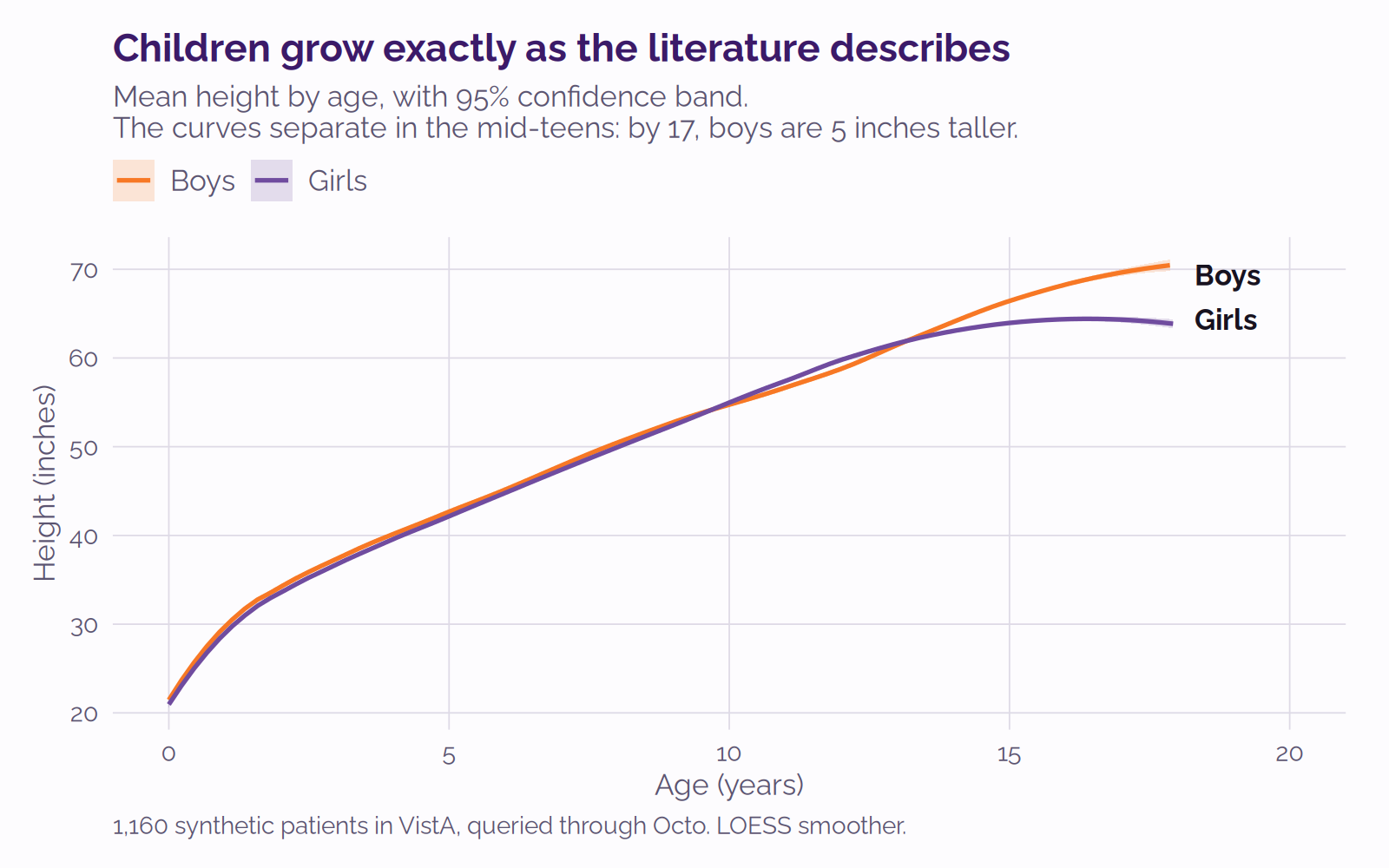
The curves for boys and girls track each other through childhood and then separate in the mid-teens, which is what the literature describes: the adolescent growth spurt arrives “on the average, nearly 2 years later in boys than in girls”,1 while girls are briefly the taller group; boys grow for longer, overtaking girls. At 17, boys average 69.4 inches and girls 64.4 — a difference of 5.0 inches. The Welch two-sample t-test below shows that the height difference at 17 is statistically significant.
> # every height reading taken during the patient's 17th year
> h17 <- peds %>% mutate(age_yr = floor(age_at)) %>% filter(age_yr == 17)
>
> # compare the sexes, without assuming their variances match
> t.test(val ~ sex, data = h17, var.equal = FALSE)

	Welch Two Sample t-test

data:  val by sex
t = -11.437, df = 162.73, p-value < 2.2e-16
alternative hypothesis: true difference in means between group F and group M is not equal to 0
95 percent confidence interval:
 -5.870369 -4.141760
sample estimates:
mean in group F mean in group M
64.35644 69.36250var.equal = FALSE asks for Welch’s version rather than Student’s, which suits two groups of unequal size (101 girls, 80 boys) with no reason to assume matching variances.Analyzing hypertension diagnoses vs BMI (chart, chi-square)
Does a hypertension diagnosis go with high body-mass index (BMI)? First, the diagnosis: A VistA problem can be coded in ICD-9, ICD-10 or SNOMED CT. This query asks for all three:
htn <- dbGetQuery(con, "
  SELECT DISTINCT pr.patient_name AS patient
  FROM   problem1 pr, icd_diagnosis i
  WHERE  pr.diagnosis = i.icd_diagnosis_id
    AND  pr.patient_name >= 101076 AND pr.patient_name <= 102235
    AND  i.code_number IN ('401.0','401.1','401.9',   -- ICD-9  essential hypertension
                           'I10.','I15.0')            -- ICD-10 same, VistA spelling
  UNION
  SELECT DISTINCT pr.patient_name AS patient
  FROM   problem1 pr
  WHERE  pr.patient_name >= 101076 AND pr.patient_name <= 102235
    AND  pr.snomed_ct_concept_code IN ('59621000',    -- SNOMED essential hypertension
                                       '38341003')    -- SNOMED hypertensive disorder
")
Now the BMI. The chi-square test is by patient, not by reading, as the unit of analysis. The measurements are collapsed into one row per adult carrying a mean height, weight and systolic pressure, with the BMI computed from height and weight:
# Collapse to one row per adult patient, averaging their repeated readings.
pat <- vitals %>% filter(age_at >= 18) %>%
  group_by(patient) %>%
  summarise(sex    = first(sex),
            height = mean(val[vital_type == 8], na.rm = TRUE),   # inches
            weight = mean(val[vital_type == 9], na.rm = TRUE),   # pounds
            sys    = mean(sys, na.rm = TRUE)) %>%                # mmHg
  mutate(bmi = 703 * weight / height^2,   # 703 converts lb/in^2 to metric BMI
         # attach the diagnosis found by the query above
         htn = factor(ifelse(patient %in% htn$patient,
                             "Hypertension coded", "Not coded"),
                      levels = c("Not coded", "Hypertension coded")))
Cross-tabulating diagnosis against BMI class gives six cells:
| BMI class | Hypertension coded | Not coded | Total |
|---|---|---|---|
| Normal (< 25) | 2 | 152 | 154 |
| Overweight (25–30) | 131 | 508 | 639 |
| Obese (30+) | 21 | 104 | 125 |
A chi-square test of independence is the correct statistical test here: both variables (BMI and Hypertension Diagnosis) are categorical, and every expected cell count comfortably exceeds five. In R that is one line:
> # sort each adult into a BMI class at the standard cut-points
> pat$bmi_class <- cut(pat$bmi, c(-Inf, 25, 30, Inf),
+                      labels = c("Normal", "Overweight", "Obese"))
>
> # cross-tabulate class against diagnosis, and test for independence
> chisq.test(table(pat$bmi_class, pat$htn))

	Pearson's Chi-squared test

data:  table(pat$bmi_class, pat$htn)
X-squared = 32.773, df = 2, p-value = 7.646e-08
The same counts, as a chart:
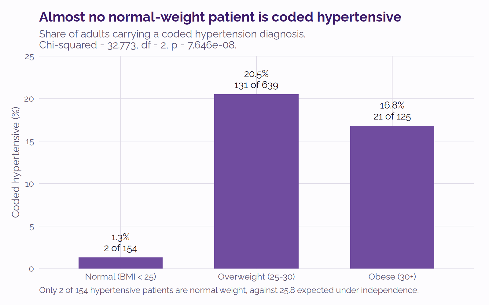
The striking cell is the first one in Table 1: only 2 of 154 normal-weight adults carry a hypertension diagnosis. Independence predicts about 26 — the expected count for a cell is its row total times its column total, divided by the grand total, so 154 normal-weight adults × 154 coded hypertensives ÷ 918 adults = 25.8. That gap, repeated across the six cells, is what the chi-square statistic measures.
Analyzing blood pressure measurements vs BMI (chart, Pearson’s coefficient)
So weight predicts the diagnosis of hypertension; does it predict the actual blood pressure?
No. A Pearson correlation asks whether two continuous measures move together in a straight line. Between BMI and systolic pressure, it finds no association:
> # is there a straight-line relationship between BMI and systolic pressure?
> cor.test(pat$bmi, pat$sys)

	Pearson's product-moment correlation

data:  pat$bmi and pat$sys
t = 0.36357, df = 916, p-value = 0.7163
alternative hypothesis: true correlation is not equal to 0
95 percent confidence interval:
 -0.05273312  0.07665606
sample estimates:
       cor
0.01201175
An r of 0.012 means no association worth the name; an r of 1 would be a perfect one. The confidence interval straddles zero, so the data show no evidence of a straight-line link at all. Plotting one against the other makes it plain:
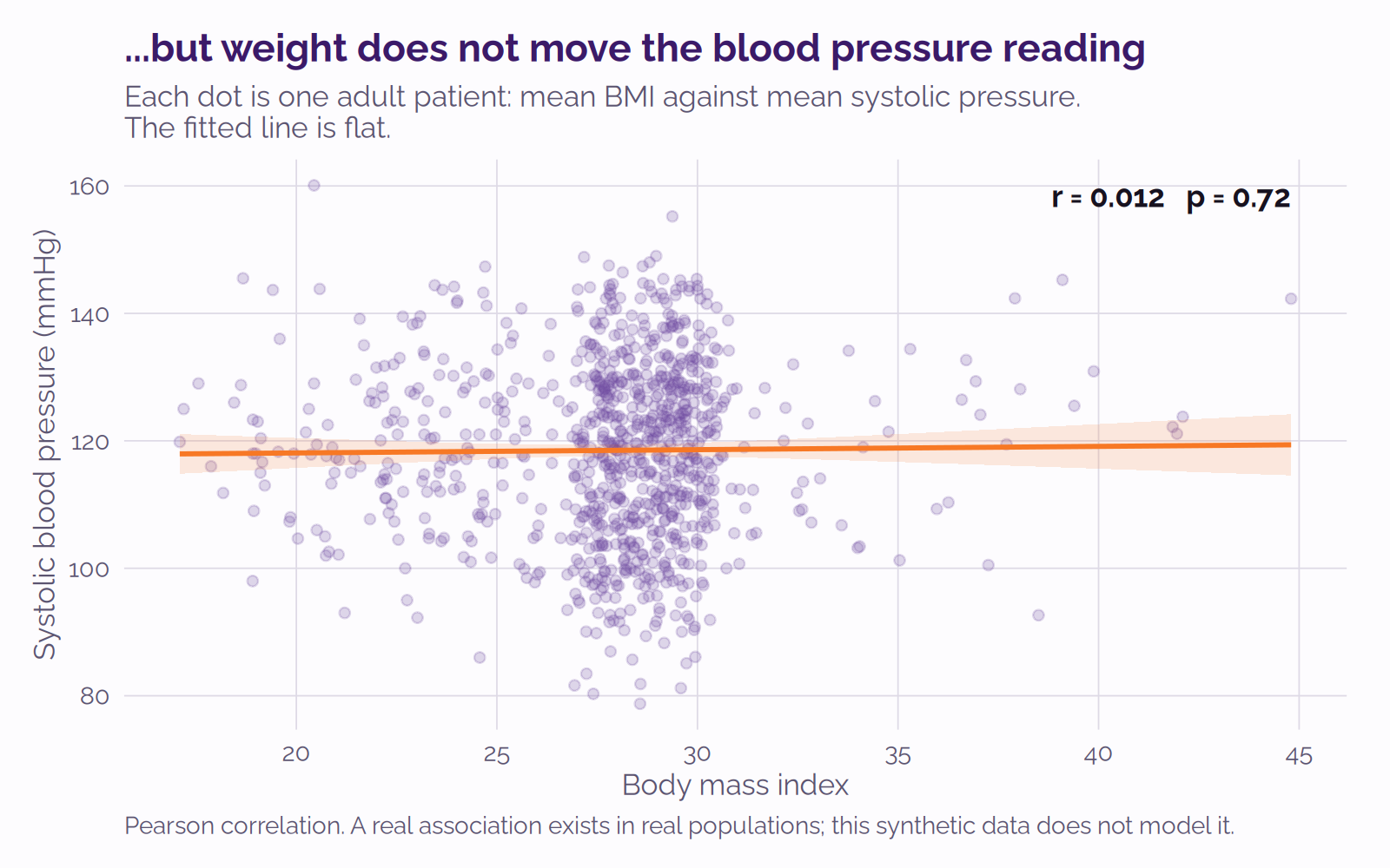
This is an artifact of Synthea; in real populations BMI and blood pressure are linked: a meta-analysis of 25 randomized trials covering 4,874 participants found that every kilogram of weight lost lowers systolic pressure by about 1 mmHg.2
Distribution of HbA1c (chart)
Claude plotted the distribution of HbA1c — the standard three-month measure of blood-sugar control. A surprise was lurking in the data:
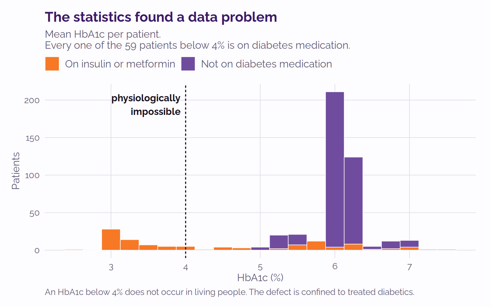
An HbA1c below 4% does not occur in living people. Fifty-nine patients here have one; and all 59 are on insulin or metformin. Treated diabetics, the very patients whose HbA1c matters most, have impossible values. The other 88% of the cohort looks entirely normal.
Here’s how Claude chased the impossible data down:
# Mean HbA1c per patient. lab_data maps LRDFN to DFN via name field to allow us to limit to only Synthea patients
a1c <- dbGetQuery(con, "
  SELECT d.name AS patient, AVG(CAST(r.result_value AS NUMERIC)) AS a1c
  FROM   lab_chem_result r, lab_data d
  WHERE  r.lrdfn = d.lrdfn AND d.parent_file = 2
    AND  d.name >= 101076 AND d.name <= 102235
    AND  r.test = 462 AND r.result_value IS NOT NULL
  GROUP BY d.name")

# Who is on insulin (VA drug class HS501) or an oral hypoglycaemic (HS502)?
rx <- dbGetQuery(con, "
  SELECT p.patient, g.va_drug_class_code
  FROM   prescription p, drug g
  WHERE  p.drug = g.drug_id
    AND  p.patient >= 101076 AND p.patient <= 102235")

on_drug <- unique(rx$patient[grepl("^HS50[12]", rx$va_drug_class_code)])
a1c$treated <- a1c$patient %in% on_drug
table(impossible = a1c$a1c < 4.0, treated = a1c$treated)
treated
impossible FALSE TRUE
FALSE 384 49
TRUE 0 59
Of note, the glucose values for the same patients were all physiologically normal, which brings us to the next section.
Correlation of glucose and HbA1c (chart, Pearson’s coefficient)
Blood glucose and HbA1c measure the same underlying reality on different timescales, and the relationship between them is well established: the ADAG study3 gives estimated average glucose = 28.7 × HbA1c − 46.7. In real life, glucose and HbA1c should be somewhat correlated. How do they correlate in the data?
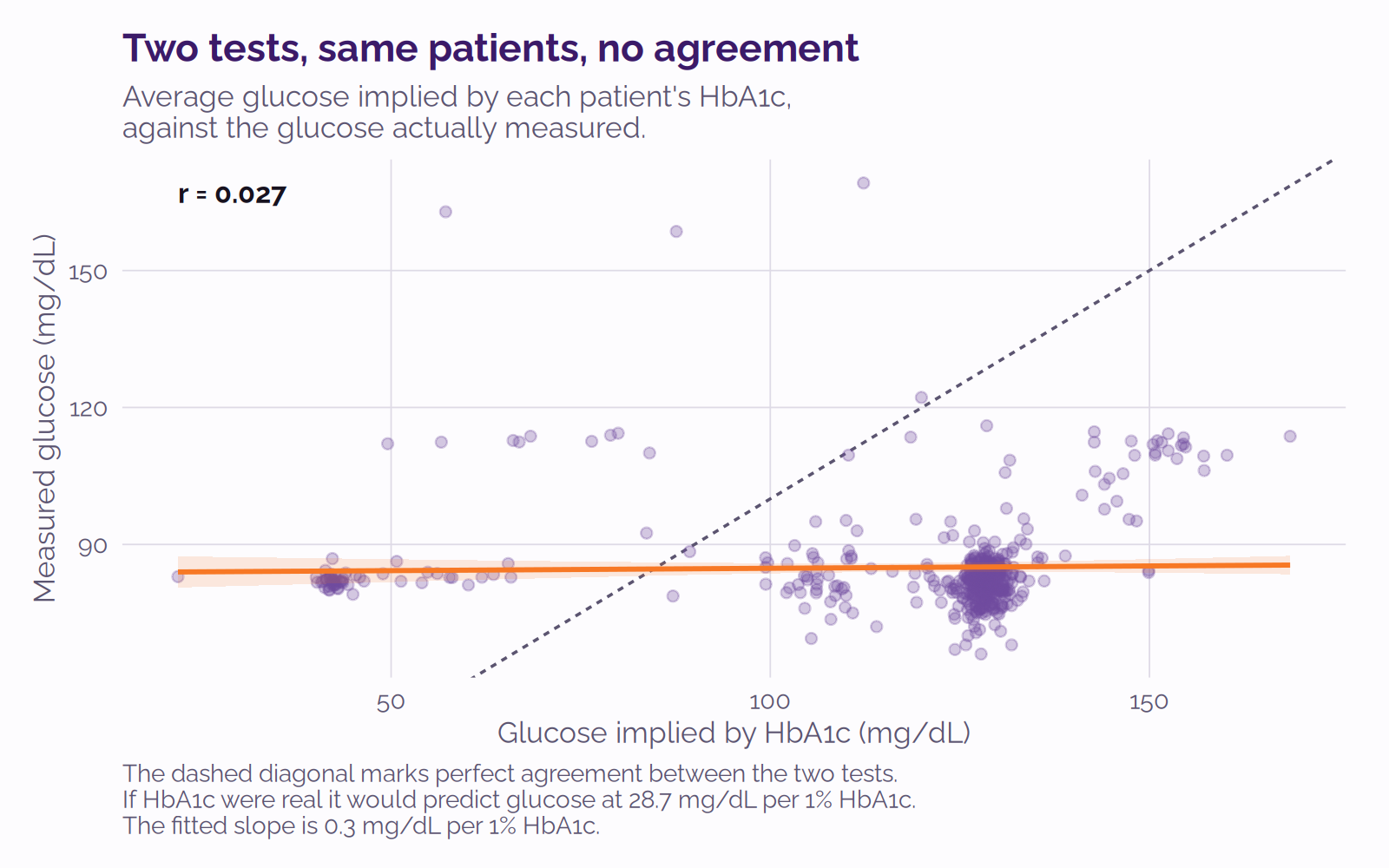
Clearly, there is no correlation: r = 0.027, p = 0.56 across 492 patients, showing that Synthea data again doesn’t produce realistic data in this scenario. Examination of the Synthea source shows the issue: it selects a glucose at random from a range and derives their HbA1c separately, so the two never have to agree — reported as synthea#1694.
Trying all the analyses for yourself
I published the Docker image with VistA containing 1,160 Synthea patients (1,000 live ones) and Octo ready to go. Run it like this:
docker run -d -p 127.0.0.1:2222:22 -p 127.0.0.1:8001:8001 -p 127.0.0.1:9430:9430 \
    -p 127.0.0.1:8089-8090:8089-8090 -p 127.0.0.1:1338:1338 \
    --name=vehu yottadb/octo-vehu:2026-08-synthea1000
ROcto comes up with the container, so port 1338 is serving as soon as it starts. That is the connection Listing 1 opens, and from there every query in this post works as printed.
Then run analysis.R, the script used to generate the results for this post. It needs R with DBI, RPostgres, dplyr and ggplot2, and it regenerates every figure and every number quoted here — the chi-square, the t-tests, the correlations and all five charts — in a few seconds.
Software used
- VEHU VistA, which I maintain monthly with patches released from the VA; patched with
- VistA-FHIR-Data-Loader; and
- VistA-DataLoader.
I used Synthea to generate 1,000 live patients, then imported them into VistA; the instructions are in VistA-FHIR-Data-Loader.
The OSEHRA VistA repo scripts exported the data, which docker-vista reassembled into a new, smaller image yottadb/octo-vehu:2026-08-synthea1000.
The VistA image includes the SQL DDLs from YDBOctoVistA — notably lab_chem_result.sql, which lets you read lab data in VistA, which is not stored in a traditional FileMan format.
YottaDB r2.06 and Octo 1.1.0 inside that image project the M globals to SQL and serve them over the PostgreSQL wire protocol.
I ran the yottadb/octo-vehu:2026-08-synthea1000 image with Docker. It includes R 4.3.1, with sub-modules DBI 1.2.3, RPostgres 1.4.10, dplyr 1.2.1, and ggplot2 4.0.3.
I used Claude Code to investigate the database for potential stories for this blog, to write the R scripts and to prepare the diagrams. It is much better at statistics than I am. I only included statistical concepts I learned in college 20 years ago, including Pearson’s r coefficient, chi-square, and t-tests.
Documentation:
References
1. Marshall WA, Tanner JM. Variations in the pattern of pubertal changes in boys. Arch Dis Child. 1970 Feb;45(239):13–23. Boys reached peak height velocity at a mean age of 14.1 ± 0.14 years, “on the average, nearly 2 years later in boys than in girls”. doi:10.1136/adc.45.239.13. PMID: 5440182. PMCID: PMC2020414. The companion paper for girls is Marshall WA, Tanner JM. Variations in pattern of pubertal changes in girls. Arch Dis Child. 1969 Jun;44(235):291–303, doi:10.1136/adc.44.235.291, PMID: 5785179. ↩
2. Neter JE, Stam BE, Kok FJ, Grobbee DE, Geleijnse JM. Influence of weight reduction on blood pressure: a meta-analysis of randomized controlled trials. Hypertension. 2003 Nov;42(5):878–84. Across 25 randomized trials and 4,874 participants, blood pressure fell by −1.05 mmHg systolic (95% CI −1.43 to −0.66) and −0.92 mmHg diastolic (95% CI −1.28 to −0.55) per kilogram of weight lost. doi:10.1161/01.HYP.0000094221.86888.AE. PMID: 12975389. ↩
3. Nathan DM, Kuenen J, Borg R, Zheng H, Schoenfeld D, Heine RJ; A1c-Derived Average Glucose (ADAG) Study Group. Translating the A1C assay into estimated average glucose values. Diabetes Care. 2008 Aug;31(8):1473–8. The reported regression is AG (mg/dl) = 28.7 × A1C − 46.7, R2 = 0.84, P < 0.0001. doi:10.2337/dc08-0545. PMID: 18540046. PMCID: PMC2742903. ↩
Credits
- Data from: Genetic variants and clinical indicators used to build nomogram model used for blogroll and featured images is in the public domain.
Published on August 27, 2026